css transition
Transitions are when the browser animates from one state to another (A to B). They’re usually triggered by an action such hovering over an element, or adding or removing a class using JavaScript.
Transitions take place in the browser when an element changes from one state to another. The browser draws the frames between each state automatically to create movement.
transition
Notice the transition property to the first button reference in the CSS state. This tells the browser to apply a transition to any change of state such as on hover as well as when changing back from the hover state.
If we applied the transition property to the hover state only, it would only transition to the hover state but not back.
button {
  background: white;
  transition: background 0.5s linear;
}

button:hover {
  background: green;
  /*transition: background 0.5s linear;*/
}
css Animations
Animations are more involved, and let you create sequences of animations with as many keyframes as you need along the way. They trigger automatically, and can loop.
animation-delay
If the animation loops, the delay does not apply each time it loops. The delay only applies to when the animation is applied to the element.
You can give this property a negative value such as -1s. This would cause the animation to start as if a second has already elapsed.
animation-fill-mode
By default, an animation will play and then the element returns to its normal state.Using animation-fill-mode we can have the animation “stick” at either the end or beginning state.
Using the value forwards tells the animation to finish and stay on the last keyframe. The value backwards returns to the first keyframe when the animation finishes.
animation-play-state
If you ever need to pause or resume an animation, this property lets you do so. It takes the values of running or paused, with the default being running. One idea might be to set this value on an animation using JavaScript.
animation-timing-function
This takes the same values the timing function property in transitions, but behaves a little differently. While a timing function, such as ease-out applies to the entire transition, the timing function of an animation applies between each keyframe.
/*animation-timing-function : ease-out;*/
@keyframes foo {
  0% {
    /* Animation starts fast and ease-out makes it slow down before 50% */
  }
  50% {
    /* Again, starts fast and slows toward 100% */
  }
  100% {
    /* fin */
  }
}

/*so we usually define animation-timing-function on a per-keyframe basis*/
@keyframes my-animation {
  0% {
    /*...*/
    animation-timing-function: linear;
  }
  50% {
    /*...*/
    animation-timing-function: ease-out;
  }
}
Things to look out for
- keywords
fromandtois simple an alternate way of writing0%and100% - You may have noticed that sometimes more than one percentage value is used on the same line. This is a way to have the animation pause for a while, or hold a particular state.
/*This example will have the element start with an opacity of 0,
and stay invisible until 20% through the animation*/
@keyframes name {
  0%,
  20% {
    opacity: 0;
  }
  100% {
    opacity: 1;
  }
}
- Lastly, you can omit the 0% keyframe and the browser will take the element’s style as implied. For example, to have something fade away, we don’t necessarily have to give it a starting opacity of 1 (assuming the element is already visible)
@keyframes name {
  100% {
    opacity: 0;
  }
}
- If a keyframe rule doesn't specify the start or end states of the animation (that is,
0%/fromand100%/to), browsers will use the element's existing styles for the start/end states. This can be used to animate an element from its initial state and back.
Multiple animations
拖拽过渡动画

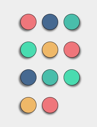
初始状态下维护一个 layout 数组, 用来记录各个 ball 的 translateX 和 translateY, 再维护一个 order 数组,用来记录各个 ball 的顺序,当鼠标拖拽球进行移动时,计算拖拽移动的距离 deltaX, deltaY,并根据整体 width 和 height 对 order 数组进行重排序,对前进行拖拽的 ball 根据鼠标移动的距离进行 translate 变换, 其余的 ball 则变换到重新排序后的 layout[index] 位置上去,layout 数组会保证各个 ball 的位置最终结果
比如刚开始 order=[0, 1, 2, 3, 9, 4, 5, 6, 7, 8, 10], 当最后一个球拖拽到第一个球位置上之后,order 进行重排,order=[10, 0, 1, 2, 3, 4, 5, 6, 7, 8, 9],所有位置的 DOM 节点都会后移一个位置,translate 参数可以在 layout 中查询出来,剩下的交给浏览器进行位移动画即可
FQ
- The transition can only be applied to animatable properties.
- Check that the animating property is not set to auto. Transitions can not animate CSS properties that are not explicitly set and auto
Why does switching from display: none to display: block not display a transition animation?
The reason switching from display: none to display: block doesn't display a transition animation is because the display property is not one of the CSS properties that can be smoothly transitioned. Transition animations typically apply to properties that can smoothly transition between different values, such as opacity, width, height, margin, padding, and others.
When you switch the display property from none directly to block, the browser instantly shows or hides the element with no transition. This is because changes in the display property are instantaneous and have no intermediate states, making it unsuitable for transition effects.
If you want to achieve a transition effect from invisible to visible, you can use the opacity property or the visibility property instead of the display property. Here's an example using the opacity property:
.element {
  opacity: 0;
  display: block;
  transition: opacity 0.5s;
}

.element.visible {
  opacity: 1;
}
In this example, we transition the opacity of the element from 0 to 1, creating a transition effect from invisible to visible. You can trigger this transition effect by adding or removing the "visible" class.
- display:none 和 display:block 对元素 animation 的影响
display: none:当一个元素的 display 属性被设置为 none,该元素会从文档流中移除,它在页面上将不可见,也不占用空间。 任何应用在这个元素上的动画、过渡或其他视觉效果都将被取消,因为该元素已经被隐藏,无法显示任何动画效果。
display: block:当将一个元素的 display 属性从 none 设置为 block,元素将重新显示在页面上,并按照正常的文档流占用空间。 如果你在元素上应用了动画,这些动画会在元素重新显示时生效。这意味着动画将在元素由不可见变为可见时播放。 总之,display: none 会立即隐藏元素,取消任何与元素相关的动画,而 display: block 会使元素重新显示,同时允许动画在元素显示时生效。如果你希望在显>示和隐藏元素时有过渡效果,通常使用 opacity、visibility 或其他 CSS 属性来实现动画,而不是直接切换 display 属性。
